Posts by "creativepattern"

When Should You Redesign Your Website?

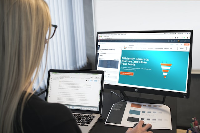
Is it time to rebuild your website?

An online presence is more than simply a means of advertising your company’s offerings. This is a permanent shop window through which your core target demographics may be exposed to your brand around the clock. Your website is “always on,” meaning it must be successful at all times, whether a visitor is a new prospect, a customer contemplating a first purchase, or another key stakeholder. That’s why it’s crucial to keep your website under constant scrutiny to make sure it’s always effectively representing your brand.

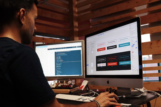
A website’s effectiveness is affected by its front- and back-end components. When considering the prospect of a redesign, it’s crucial to give equal weight to both.

Copy, design, and other material that generates an engaging user experience and turns users and prospects into customers who make up the front end.

Your site’s “back end” is its underlying infrastructure. Improve your site’s SEO, keep your material fresh, and more with assistance.

This article will help you decide if a complete site redesign is necessary by discussing potential issues with your site’s front and back-end components. If you’re thinking of redesigning your website, these are five warning signals to look out for.

1. Your website is not helping you achieve your company’s goals.

What are you hoping to achieve with this website?

Among many other things, a website may serve as a platform for direct sales to visitors or as a resource for customers to learn more about your company and its products. Before considering factors like usefulness and aesthetics, you should always establish and prioritize your company goals. A company focusing on direct consumer sales of a commodity product will require a different web design than a non-profit trying to increase member participation.

Your website’s ROI will fall short of expectations if it isn’t built with your business objectives in mind.

Your website is out of sync with your company goals if it isn’t generating any (or enough) income, if it doesn’t rank well in search engines, or if the content doesn’t match your current products or value propositions.

2. Your bounce rates are high, and your conversion rates are poor.

The problem with your website is the high bounce rates and low conversions. Though, let’s begin with the most basic question.

Why are things like bounce and conversion rates important, and what are they?

In order to provide the immersive and engaging experience you want for your visitors, we employ several measures to assess how well your site is doing. When a person visits your website but only looks at one page before leaving, we call that a “bounce” because it’s probable they weren’t interested in your content or items enough to dig deeper. The user came in, checked you out, and then left. Perhaps indefinitely.

When visitors to your website perform the action you want them to do, you’ve achieved a conversion. It’s the opposite of a bounce, yet just as desirable. A conversion on a software-as-a-service website would most likely be submitting a form to request a demo. Alternate kinds of conversion exist. They may be represented by someone subscribing to your newsletter or sharing one of your pages on social media. Insufficient user engagement and failure to elicit the appropriate actions from visitors indicate a low conversion rate.

Heatmapping is a must-have tool when it comes to gauging how interested people are in your website. A heatmap will display where people spend the most time on your website. If you’re having trouble keeping your visitors engaged, a heatmap can show you where they’re clicking away from your page. It’s a quick and easy way to see how well your CTAs, graphics, texts, and entire experience perform.

A user who stays on your site for longer and interacts more actively with it is more likely to buy something.

3. Your site loads slowly.

Nothing is more annoying as a user than a slow-loading website. The quality of a website’s experience, design, or content typically won’t be enough to keep users hanging around if the site loads too slowly. It’s been found by Google’s studies show that if a website takes longer than three seconds to load, over 53 percent of visitors will abandon it.

Inadequate development (building) or an increase in traffic that has overstressed or overloaded the site’s infrastructure on the back end are both possible causes of a delayed load time.

Despite your best efforts from a strategic and creative standpoint, your website’s performance may not be as good as it might be. You’ve probably put in a lot of effort to have the pages take too long to load, resulting in less-than-ideal outcomes.

If your page takes too long to load, you might wish your search engine rankings goodbye. SEO is crucial if you want customers to locate your business online, increase your organic traffic, and cement your position as an industry leader.

4. Your site is not mobile-friendly or responsive.

Research conducted in 2021 indicates that mobile devices now account for 54.4% of all internet traffic worldwide. It would help if you put mobile above (or at least equal to) desktop in terms of importance. It’s unnecessary to have a complicated workflow or a new layout for this. In reality, building solely mobile website designs is a thing of the past.

Here’s when the idea of responsive web design comes in handy.

Responsive web design eliminates the need for separate website desktop and mobile versions by adapting the layout and content to the viewing device.

The transition is transparent to the user. With responsive web design, people may have a fantastic visit regardless of their device.

5. Your website’s design is out of date.

A website’s aesthetic appeal is just as important as its functionality. In general, customers judge a business by the caliber of its products and services, which is why a slick website is so important.

For this reason, a website should not consist entirely of text, a few links, and a few images that are too small for their context. When designing your site, remember that a user’s initial impression will be visual.

Think about how up-to-date and stylish your rivals’ websites look compared to your own. When working with customers, we constantly remember this factor. From a diagrammatic standpoint, how does the competitive landscape look?

Web design standards are rising steadily higher. A user will always prefer a modern, well-designed website over a clunky, out-of-date one.

Conclusion

Talk to someone who can assist with a redesign if you have any of the issues described above.

It would help if you based your choice on the answers to these three crucial questions:

  • Do visitors to my site have a positive experience that allows them to easily navigate my site and absorb my present messaging and positioning?
  • In terms of functionality, how well does the site perform?
  • Is it leading to profitable outcomes for the company?

3 Mistakes to Avoid if You Want a Professional-Looking Logo

Nothing less should be spoken about you in your logo. It is essential to take the time to design an emblem that accurately captures who you are and what you stand for. What distinguishes a good logo from a terrible one, though? What can you do to increase your chances of success while creating a logo? Below you will find three errors to avoid if you want a logo that looks professional.

Do Not Follow Trends Blindly

The first guideline to remember while designing a logo is to avoid mindlessly adopting trends. Trends can inspire you and boost your creativity, although logos that simply emphasize fads frequently suffer from the drawback of frequently seeming dated.

Do you recall what the Airbnb logo looked like in the past? With its bouncy typeface, it gave off a 2000s vibe. You should aim for a timeless logo rather than the most recent or well-liked trend. It is one of the traits that many logos of well-known organizations nowadays share. Furthermore, if individuals begin with a more traditional logo rather than a fashionable one, you won’t need to rebrand as frequently.

Logo Doesnt Rhyme with Rainbow

Users may be required to select the colors for their logo that best represents their brand and business. Do you realize that colors have significance to start? For instance, the colors red and yellow stand for strength and passion, whereas the color purple is related to monarchy and spirituality. Pick colors that go with your principles or your line of items.

Furthermore, if you want your logo to seem professional, don’t use more than three colors. Have you ever noticed that the majority of company logos only use three or fewer colors? It’s because working with several intricacies at once is challenging, and it frequently appears chaotic. Similarly, Slack had to change its logo last year for this reason!

Too Many Fonts Is Like Not Enough

In a similar spirit, while designing your logo, don’t use more than three typefaces. More will often produce an uneven result. If you must utilize typefaces, go right ahead, but be sure you use readable fonts. Before selecting the ideal font, you might need to experiment with a variety. Do you understand what distinguishes serif from sans-serif fonts?

A serif font is a typeface with tiny extensions that create a line to make reading easier. They are usually employed in printed works or books. Contrarily, sans serif fonts lack these extensions and have the advantage of seeming more approachable and being better for computer screens.

Keep It Simple

Less can sometimes be preferable. What distinguishes outstanding logos from others, such as those of Target, McDonald’s, or Apple? Among other reasons, it’s because they’re easy to use! The creation of a straightforward logo has several benefits. It is firstly simpler to utilize on various media. On Facebook, your logo must be just as perfect as it is in paper. Second, straightforward logos are simpler to recall. Simplification and minimalism are fashionable right now. Because of this, companies like Starbucks have decided to refresh their logo without including all the little elements.

Its Your Logo, Not Someone Elses

What is the purpose of this logo? Designing a logo that accurately reflects your company and its ideals would be beneficial. Consequently, prior to picking up a pencil, give it some thought as to what you want your logo to stand for.

Lets Wrap it Up

Finally, there are no restrictions on logo design. One ought to be able to produce something fantastic if you only avoid those typical errors. Create something special that will instantly convey your identity.

Guidelines for Creating a Dark Theme

Contrary to popular belief, the dark mode has existed for quite some time. The default setting for the earliest computers was black and white since the screen lighting technology of the time was not yet advanced enough to illuminate the entire screen without overheating.

As a result, dark theme design has become a prominent design style, particularly in the technology sector. This is because consumers of both websites and mobile applications increasingly favor dark-mode UI.

This post will discuss the benefits and drawbacks of dark mode UI design.

What is the dark mode?

Light text on a black background is known as “dark mode,” a user interface (UI) design motif that offers an alternative to the standard black text on white background. Regarding desktops and mobile devices, both Google and Apple allow customers to switch between a bright and dark design scheme with the tap of a finger.

What is the distinction between dark mode web design and dark theme web design?

This trend toward darker backgrounds has also increased interest in “dark theme” web design. Most people confuse dark mode with a dark theme, while the latter merely applies a uniform dark tone to the user interface. Even in the light mode, the background of a website with a dark theme will be black.

There are several compelling reasons for the widespread adoption of this design concept:

When combined with bright colors and attention-grabbing artwork, black backgrounds in web design may create the impression of professionalism, luxury, and even mystery. Complementing your brand’s aesthetic, a dark theme design may provide a compelling background against which to convey your brand’s narrative if done right.

Darker backgrounds may act as an effective dramatic canvas to draw users’ attention to crucial areas of design and language, allowing them to concentrate better.

Even though it hasn’t been verified scientifically, many people who use the feature report that switching to the dark theme reduces eye strain. UI design can help alleviate dry eyes and other symptoms when using a computer for extended periods.

It stands out from the crowd; while sites with dark themes are growing in popularity, the vast majority still use lighter themes, making many websites seem the same after a while. Differentiating your product from the competition may require venturing into dark themes.

Design problems for dark themes

Let’s be straight up here. Using the interface in the dark is a fairly cool experience. However, certain difficulties come with venturing into such gloomy design territory:

Darker user interfaces aren’t great for long reading periods since they make text difficult to see (which is ironic considering that many users prefer dark mode over light because it decreases eye strain). Some saturated colors may perform great on a black print design but lack adequate contrast in a digital design and vice versa.

In design, too much of anything may be overwhelming; white space exists for a purpose. There isn’t as much room to breathe in a dark UI as in a light one. When there are too many design components on the screen, it might seem overwhelming.

When placed against a dark background, colors convey a distinct set of feelings than when placed against a light one. If you’re having trouble getting your message through on a dark background, you may want to reconsider your color scheme, which was likely picked with a light theme UI in mind.

While it’s uncommon to hear anybody complain about a dark UI theme, there are always those who prefer a lighter background. However, a small percentage of visitors will find your website’s dark theme too gloomy for their tastes.

Mobile-Friendly Web Design: Everything You Need to Know

Mobile devices already account for almost half of all internet traffic, and experts anticipate that by 2025, that percentage will rise to nearly 75 percent, thanks to advances in web design. Companies still using websites that aren’t optimized for the vast majority of their visitors face substantial consequences.

For optimal market penetration, ensure that your website is mobile-friendly.

Does “mobile-friendly” mean “responsive”?

Unfortunately, they’re not, even though this is a frequent assumption. The primary distinction between the two is that responsive websites adapt their layout and content to the watching device’s screen size. In contrast, mobile-friendly sites employ a material that remains constant across all devices.

If you visit a responsive website on your mobile device, you may see a hamburger menu instead of the complete menu on your desktop. A mobile-friendly website’s design remains the same regardless of the viewing device. Therefore it’s advisable to go with a minimal menu design to avoid overwhelming users.

It may seem contradictory, given the name, but sites with a small number of mobile visitors benefit most from a mobile-friendly design. Limitations arise in mobile-friendly design due to the need for compatibility with both small and large screens.

Responsive web design is recommended if you expect many customers to access your site from mobile devices. You will be free to design a user experience tailored to the mobile user.

Mobile-first design

A design approach known as “mobile-first” states that mobile devices should take precedence over desktop computers in the development process. Designers need to know what content is most crucial and what information mobile users must have to participate and do the required actions. As time goes on, the design is expanded to accommodate larger devices. When designing for mobile devices, it’s best to prioritize efficiency, accuracy, and usability.

What is the distinction between a fluid and a fixed layout?

The viewport’s width determines the relative dimensions used in a fluid layout (screen size). Measurements are calculated as percentages of the viewport’s maximum width, which means that while the screen size varies, the percentage of the maximum width remains constant.

On the other hand, fixed layouts employ static dimensions that do not adjust to the viewport’s width. Thus, the layout of a website would remain the same even if the viewer gradually shrank the browser window when viewing it on a desktop computer. In order to see everything, you’ll need to utilize horizontal scrolling.

Fixed layouts are typically utilized when developing a website for a single device. However, modern websites typically employ fluid design to provide excellent user experiences across a wide range of devices, which is not surprising considering the prevalence of mobile internet usage.

Responsive web design vs. progressive web applications

It’s a trap question, so don’t fall for it. The term “progressive web app” (or “PWA”) refers to a type of web-based application. However, it takes advantage of responsive web design principles. Many widely recognized businesses use PWAs, including Forbes, Uber, Starbucks, and Pinterest.

The functionality of a PWA is comparable to that of a native app (the sort you download on your phone), but there is no need to install or download it. It’s browser- and device-agnostic (although some features may not be available with outdated versions). Service worker scripts allow PWAs to provide exciting capabilities like push notifications, camera access, and location services, which were previously unavailable outside of native applications despite their speed and reliability.

One of the wonderful things about this architecture’s “progressive” nature is that features may be gradually unlocked as browser makers ship better support for them, according to Google, who first used the phrase “progressive web app” in 2015. So, PWAs continue to advance in their capabilities.

What criteria should you use to determine if a progressive web app is right for you? Obviously, it is a question best answered by analyzing your company’s requirements for various functions. A progressive web app might be the way to go if you want to provide your consumers with an app-like experience without building a native mobile app.

Interesting Web Design Statistics

Does the Internet have any limitations? We do everything from buying clothes to buying food to buying books (either physical or digital), from sending greeting cards to making vehicle appointments to watching television shows. Almost half (47%) of all consumer spending is transacted on the Internet. Furthermore, Google discovered that 90% of in-store purchases were made after an internet search and that this trend held for over a week.

Businesses that directly serve consumers (B2C) aren’t the only ones to embrace the digital age. And the same holds in the B2B (business-to-business) sector. Seventy-one percent of business-to-business customers start with a generic Google search.

But why does this really matter? Whether you’re selling to consumers or other businesses, most potential customers will first check out your website to learn more about you and your offerings before reaching out to you.

Use the following data about web design to improve your website and digital marketing methods, increasing your chances of making sales.

Decision-makers in the business-to-business market are increasingly from the millennial generation.

The millennial generation (20-35-year-olds) is far past the entry-level employment phase. According to a study published in the Harvard Business Review, 73 percent of millennials were involved in decision-making at B2B firms.

According to the 2019 B2B Buyers Survey Report findings, internet evaluations are the single most useful factor in the decision-making process for over half of millennial respondents.

The values of millennials are another topic of research. According to Forbes, as many as 80% of millennials who make B2B purchasing decisions care about a company’s commitment to the community, the environment, and charitable giving. Here’s what Google thinks will happen as a result:

More weight will be given to a company’s stance on social and environmental concerns, including climate change, diversity and inclusion, and sustainability.

Thanks to this study’s findings, your prospective customers are younger than you would have guessed, curious about your company’s guiding principles and values, and relying on your online standing before making a purchase.

Keep your target audience’s needs and values in mind from the beginning to the end of the web design process for maximum impact.

First impressions are crucial, and you must make them in less than a second.

Since people form opinions about a website’s aesthetic attractiveness in as little as 50 milliseconds, it’s crucial that your page immediately capture and hold their attention.

While it’s important to have engaging content throughout your website, research from the Nielson Norman Group found that most of your visitors’ attention was focused on the page section visible above the fold. The first two minutes accounted for 74% of the time spent watching. Above the fold, clearly communicate how your product will solve the user’s issue.

You may increase your website’s effectiveness by using A/B testing.

If you want your website to be as profitable as possible, it needs constant maintenance and updates.

Comparing two options through A/B testing is a wonderful method for finding improvement areas. During A/B testing, two variants are compared head-to-head to determine which yields superior results.

The A/B test case studies provided by CrazyEgg demonstrate how even little adjustments may significantly impact conversion rates:

The insurance giant Humana “saw a 192% boost in CTR (click-through rate) after switching the CTA (call-to-action) from ‘Shop Medicare Plans’ to ‘Get Started Now.'”

Changing just one thing, like an image or the wording of a call to action, may greatly impact conversion rates.

Conversion rates are unexpectedly affected by page load times.

The importance of a site’s loading time is often underestimated.

A recent study looked at the connection between site performance and conversion rates and concluded that pages that load in under 5 seconds have greater conversion rates. In addition, a 4.42 percentage point increase in conversion rate was seen for every one-second cut from the optimal five-second window. Wow, that’s a serious force.

Several factors may be tuned to increase site speed, including image compression, redirection management, and server response time.

Google uses load times as a ranking signal, regardless of whether or not they affect conversions. If your site loads slowly, you may see a drop in both your search engine rankings and your organic visitors.

Mobile-first design is dominating.

A recent CNBC story forecasted that by 2025, “almost 3.7 billion individuals,” or 72.6% of all internet users, will do it only through their smartphones.

Even if that isn’t reason enough to give responsive web design the attention it deserves, remembers that in 2020 Google switched to a mobile-first indexing strategy for the whole web. For this reason, the mobile version of your site will always be the first to be crawled by Google. A poor mobile design, or the lack of any design, will have a detrimental impact on your ranking.

It’s not just you if you’re reading this and realizing it may be time to give mobile marketing a higher priority. According to Forbes, “the percentage of marketing budget spent on mobile maintains its upward trend and is predicted to continue to climb” (73% growth over the next five years).

Effective lead generation relies heavily on digital marketing.

Traditional forms of advertising have been overtaken by their digital counterparts (email, websites, PPC) during the previous decade. In contrast to the predicted reduction in spending on traditional marketing channels, spending on digital channels is expected to climb by 13% over the next year.

Blogs, videos, social media postings, and other content marketing are all excellent ways to raise your brand’s profile and get people talking about it online.

The “Learn More” call to action appears at the end of the post. The blog informs the reader and encourages them to sign up for Slack. To further increase Slack’s exposure, they may post the blog on their social media accounts.

The power of blogs to propel rapid expansion cannot be overstated. “81% of organizations regarded their blog as crucial to B2B lead creation,” claimed Blue Corona. In addition, HubSpot found that “70% of marketers are actively engaging in content marketing” in the present day’s industry.

It’s crucial to invest money into SEO.

Search engine optimization (SEO) is a form of digital marketing that improves the quantity and quality of organic visitors to a website. Regarding indexing and ranking sites for the SERP (search engine results page), Google considers various elements (keywords, site speed, build quality, etc.).

Researching and planning for creating content based on the keywords your intended audience will most likely use entails a bit of detective work.

Understanding Google’s current algorithm is a must for doing efficient keyword research. For example, Google’s BERT upgrade (October 2019) changed the emphasis from single keywords to search intent and context.

Is SEO worth the money it costs? Over 65% of B2B marketers claim SEO has the most influence on their lead generation goals, according to Blue Corona, while 64% of marketers spend on SEO, according to HubSpot.

By combining this data with current web design best practices, you and your team will be in a great position to make a groundbreaking website.

The Ultimate Responsive Web Design Guide

Do you remember the days of dial-up internet with desktop monitors the size of your microwave? Today, there are desktop computers, notebooks, tablets, tablets that resemble laptops, smartphones, and smartphones that resemble tablets. We have a wide variety of these gadgets, and we all want the same high-quality online experience across the board. Particularly with mobile devices.

For optimal market penetration, ensure that your website is mobile-friendly. How? Designing a responsive website.

Responsive web design

It’s not a complicated idea, yet it has a significant effect. Said responsive web design is a technique that improves website layout for users across all devices. Websites use specific coding methodologies to adjust their elements’ size, position, and visibility in response to the viewing device.

Design thinking is essential to responsive web design because it is a solutions-based approach that seeks to anticipate and answer the demands of the people the design is for. In order to think creatively about design, you must ask yourself questions like:

  • How can I make it simple for users to browse the website using a touchscreen or a cursor?
  • What material is most necessary for the user to see on a smaller screen?
  • Will the menu be accessible and simple to use across all screen sizes?

Such inquiries, along with others, can guide the technical implementation of responsive web design.

How does responsive and adaptive web design differ?

Both are valid strategies, although the former is more common. So, let’s start by investigating responsive design in more detail.

Responsive web design adapts its layout depending on the width of the user’s browser window using well-crafted CSS (Cascading Style Sheets) media queries (the area of the screen that displays information). It’s similar to an “if/then” statement (the type used for scientific hypotheses). Query X should be used if the viewport width is less than 600 pixels.

Through techniques like collapsing columns, stacking photos, concealing information, etc., the layout adapts to the viewport’s size while keeping the content in proportion. We will soon go through how to accomplish these goals using fluid layouts and adaptable media.

Websites with an adaptive design utilize templates for the most popular screen widths. Each layout is static, which means that the content does not change. A PC version may include a huge backdrop photo that doesn’t work on a mobile device’s display. A solid background may be used in the design on a smaller display. Various layouts for various sizes. This method involves additional preparation on the front end, but it may be the best option for companies that have a thorough awareness of their customers’ devices.

Is it important to have a responsive web design?

Yes. Websites with responsive layouts provide optimal viewing environments for users across all devices. Websites that don’t provide excellent design when and where the user wants it to have higher bounce rates and miss opportunities to convert visitors into customers in today’s device-saturated market. In addition to saving time and money, responsive web design requires less maintenance. For most companies, this is reason enough to implement a responsive web design.

Nonetheless, that’s not all. Google gives mobile-friendly websites more attention. Since it just needs to index one version of a responsive or mobile-friendly site, it can do so much more quickly (rather than separate desktop and mobile versions). Furthermore, Google will rank websites lower if they provide a bad user experience.

Can I make my existing website more responsive?

Yes. Most websites may have their design and development updated without completely rebuilding the site from the ground up. However, much like house improvements, the time and money needed to optimize responsiveness will depend on the scope and difficulty of the work involved. The current designs and code’s quality and substance are crucial factors.

The steps needed to make your website responsive may be determined by having a professional web design and development business perform an audit.

What Are the Trends in Web Design For 2022?

Your website’s trustworthiness relies heavily on its visual appeal, and certainly, a bad user experience may lose your business. The website design shouldn’t take second place to more crucial concerns like functionality and usability. The colors, layout, and other visual aspects of your background should all contribute to building a consistent brand image for your business.

Technology trends evolve rapidly (which is why our web designers stay so busy). You need only look back a few years to recognize the radical shifts in the visual language and website functionality. Unlike the flashy, text- and feature-heavy websites of the 2000s and 2010s, today’s minimalistic style emphasizes simplicity.

1. Lowering “Friction.”

These days, simplicity and clarity in design are highly prized. Therefore you shouldn’t clutter your work with unnecessary ornamentation. Difficult animations and an excess of content, texture, color, and typeface contribute to a cluttered web page. In order to focus on the site’s primary purpose, a minimalist website removes any unnecessary elements. Instead of cramming in as many features as possible, you should identify one central point to highlight and build around.

2. The emergence of micro animations

Videos have always been popular, and they only continue to grow in popularity with consumers. Although GIFs and other types of micro-interactions are becoming increasingly popular, including too many of them on a website can significantly impede its performance. A powerful tool for encouraging visitors to take action on your website, but they won’t tell your brand’s narrative or show them how to use your product (keep that for video).

3. Good color combinations

There is no need for monotony when using a minimalistic design. A website with a bright and striking color palette may attract attention without resorting to over-the-top animations or effects. Adding a single accent color to a monochromatic design may make a huge difference. The color white is optional for all whitespace.

4. Parallax scrolling

By making the background move more slowly than the foreground, you may establish a sense of depth and hierarchy in your design. In addition, it can assist get people to pay attention to forms and calls to action.

Tips for constantly evolving website design

It’s neither practical nor cost-effective to constantly make changes. Therefore, developing a solid design that can serve your needs for several years is important. While the tendencies above are all the rage at the moment, the items below will continue to be popular with website visitors for many years.

Ensure that users with disabilities can access all information by incorporating features such as keyboard navigation, closed captioning, and alt text for pictures.

Create a mobile-friendly website with a layout optimized for thumb scrolling.

Ensure that your page headers begin with an H1 tag.

Make calls to action that direct readers to forms, articles, and other content.

Make sure your testimonials are front and center by adding a module (or even a new page) to your website.

Though it’s best to use your photographs rather than stock images, it’s still helpful to know how to choose the best options when you need stock pictures. It’s preferable to use photographs of actual events rather than staged ones with everyone smiling and waving hi-fives at the camera.

How to Pick the Ideal Color for Your Call to Action Buttons

It’s been proven that the prominence of CTAs like “Buy Now” and “Subscribe” greatly increases the likelihood of gaining new subscribers, customers, and financial gain.

However, various aspects are determining how buyers will interpret the colors of your CTA buttons, making it a difficult subject to choose the right color for your campaign, email, or product page.

Different civilizations have various connotations with each hue. In the West, the color blue is commonly associated with men, whereas in China, it is more commonly associated with women.

Catholics consider blue a symbol of optimism and health, whereas people in the Middle East see it as a symbol of safety and protection (spirituality and immortality).

Given that people have different associations with different colors, it might be challenging to choose a single color for a call-to-action button and assume it would appeal to everyone. Instead, you should ensure that your call-to-action buttons stand out from the page’s backdrop and are easy to see, no matter what color.

Concurrently, it would help to use color psychology in your CTA to determine which colors elicit the desired feeling and action.

This post will teach you how to pick the ideal color for your call-to-action button so that it converts without eliciting any negative responses.

Why is it vital to use call-to-action colors?

People’s actions are influenced by the meanings and emotions linked with the colors they see.

For instance, the color red is known to increase a person’s heart rate, breathing rate, and blood pressure. The opposite is true with blue, related to reduced BP, respiration, and heart rate.

Studies at the University of British Columbia found that red stimulates memory and focus while blue encourages originality.

In light of these and other studies, it stands to reason that marketers would employ color psychology to design compelling call-to-action buttons and other promotional materials that elicit the desired response from potential customers. The results of other color psychology research demonstrate that there is no “right” color for everyone.

Red, for instance, may stimulate appetite, but placing it on call-to-action buttons for food companies may not increase sales. Studies have shown that red stimulates appetite in only Nile Tilapia fish.

While white is associated with purity, virginity, and weddings in Western cultures, black is associated with death, sorrow, and funerals.

In China, however, using black and white CTA buttons sends a different message since black is associated with young men and white with death and mourning.

The success or failure of your business depends on the colors you choose for your call-to-action buttons, as people of different cultures and genders react differently to colors.

Joe Hallock’s studies demonstrate that blue is both genders’ most beloved hue. However, males exhibit a decidedly stronger affinity for blue than women do. Green is the second-best hue for men, while ladies should wear purple.

Even if you know each color’s symbolic significance, certain combinations won’t work. The first consideration when selecting a call-to-action button color is how well it contrasts with your brand colors and the background of your promotional materials.

Now that you know why it’s helpful, let’s look at CTA color usage.

Choosing the right color for your call-to-action buttons

Make use of your company’s primary color.

You should utilize call-to-action button colors that coordinate with your site’s primary branding elements. When choosing a color scheme for these components, it’s important to choose one that contrasts with the color of the CTA button.

It’s best practice to use the same color for your email’s CTA buttons and header if your marketing message is cohesive and professional.

This recurrence pattern in your brand’s emails and product pages establishes your brand’s credibility.

Designing call-to-action (CTA) buttons that match these colors will go a long way toward increasing your sales conversions and income, even if blue is a favorite color of many individuals.

Use contrasting colors

Colors used by CTAs are easy to spot because of the stark contrast they create with their surroundings. By making your call-to-action buttons stand out more against the background of your homepage or product page, you may increase the number of people who click through to your conversion form.

Choose the best color for your call-to-action buttons without worrying about the psychology of colors. Instead, you should make sure the color of your CTA buttons stands out from the color that dominates your website.

Previous research, such as HubSpot’s button color A/B test analysis, has shown the efficacy of employing contrasting colors. The survey found that 21% more individuals clicked the red CTA button than the green one. The study found that even while the rest of the page stayed the same, the red button stood out more against the green backdrop. When compared to the prevailing color, red stands out as strikingly different.

Get to know your target market.

Studying and understanding your target audience according to demographics or cultural background, age, gender, etc., is the most apparent approach to determining the correct color for your CTA buttons.

Even though blue is the most popular color among both genders, you may still use various colors in your calls to action. For example, bright shades (a shade is a hue plus black) tend to be more popular among men, whereas delicate tints are more popular among women (a tint is a color plus white).

Thus, it is possible to make appealing buttons utilizing subsets regardless of the primary hue you have chosen for your CTA, with pink CTAs appealing to women and ruby red CTAs appealing to males. Similarly, you may tailor your call-to-action buttons to different demographics based on your company’s location or the culture in which it operates.

Perform some tests on your call-to-action buttons

What if the color you’ve settled on is less popular than anticipated?

Guessing the best color for your call-to-action buttons is not an option. Use an A/B test to see which button layout is preferred by site visitors.

Conclusion

Since customers behave based on how they perceive or interpret the look of CTAs, the colors of their buttons are crucial.

Color psychology isn’t always reliable when deciding what color to use for calls to action (CTAs) because different colors have diverse connotations across countries, genders, and ages. Selecting the best color for your call-to-action buttons depends on how well you can coordinate them with your brand’s color, the overall color scheme of your emails, and the contrast between the two.

Finally, before you commit to a certain color scheme, test it throughout your homepage, product pages, emails, and social media channels.

Considerations for Successful Web Application Design

Building a web app’s design and a menu that’s easy to navigate can be hard to achieve. Here are some tips to help you avoid some custom development and application challenges.

Let’s look at some of the most common challenges when designing and developing a web. We will also have a look at the implementation challenges. 

CHALLENGES FOUND IN PLANNING AND DEVELOPMENT 

« Define your goals

Well-defined goals will always make it easier and more straightforward to achieve the desired web design, application, speed, and performance. Therefore, the choices you make during the planning stage are crucial. The way you envision the app you want will set the path to follow and the requirements the app will need to be implemented.

Some considerations to be taken before you start planning your app are the following;

  • The type of public your app will target 
  • The kind of experience you want to offer them through your app
  • The key features and elements your app must have 
  • The technical requirements your app needs

« Choose the appropriate tech stack. 

Tech stacks are the combination of technological tools used by the web developers like software, programming languages, servers used, and others. 

Try to choose a well-documented tech stack, as this will help you troubleshoot other issues when developing your app; this will help you save time and money and make your life easier. 

Challenges When Implementing a Web Design

« Overall experience 

The feelings your users get throughout their journey in your app will build their reaction towards your products and services. A straightforward journey through a well-designed web will be delightful and will keep them in the game. This is just one of the reasons why it is so important to make the right decisions about the design and impression of your website before building it. 

Covering your users’ needs while offering a great experience will for sure make a difference for your business.

« Simple and easy design

You want to build your web to have appealing visuals whilst offering an easy and uncomplicated journey, with clear explanations and simple options to choose from, including all the essential information points to help them get what they want from your business.

« Loading time and app performance 

The speed and performance of your web app are two key points to make sure your users are engaged and that they will stay longer on your app, and finally, choose your products. If at this stage, they decide to leave your app, they will never come back. 

It is, then, extremely important to consider the amount of content your app displays. You will need to clarify this to the developers at the very beginning of the process in order to enable them to build an app robust enough, with the right performance level that offers your users the right speed at all times and a fluent journey when using it. 

This will make sure your app’s launch will be fast enough and will perform at its optimum level at all times, attracting and keeping users.

« What is the scalability of your application?

This presents a particular challenge because you need to think ahead. Make sure you know what you want to achieve in the future and the growth you foresee.

Your app may be simple now, but if, down the road, you want to expand your business, you may want to implement more items and information in your application, and this is when the extension capability of your app comes in. This can be achieved at the beginning of the process when the app is developed.

If you are starting a business, you should build an application that is easily scalable to make it easy to add all the content you will need whilst keeping the right speed.

« Securely navigating within your app.

And last but not least, security for you and your users is also a priority. To ensure security for both ends, you need to choose the development of your application infrastructure carefully. 

There are some global standard technologies that make all this easier and help the encryption of information between your application, and your users, one of them is the SSL certificates. This technology will protect private conversations within the app, the bank details of your customers, and sensitive info like passwords.

It is best to create complex requirements for the clients’ passwords to lessen the possibility of them being hacked. Other features like multi-factor customer authentication will make your application even more secure for your users.

Importance of Icons for a Great Web Design  

The importance of a high-quality icon set is unparallel to contemporary UI design and web design, influencing the effectiveness of a design. There are a wide variety of icon sets available on the internet, including open source and free options. However, these icon sets are not equal in terms of quality, size, and consistency. Some are good, but many are not. The selection of a high-quality icon set has seen to be as time exhaustive as customizing your own icons. Nevertheless, choosing a good icon set for your design can make a major difference.

Icons are basically small graphical images of a concept or function in UI design and web design. Their primary purpose is not to add beauty to your designs but to be simple to understand. And they can serve to provide both, but their main goal should be to provide the functionality to your design. They should provide fast and identifiable visual indicators to users for easier comprehension. There are many examples. A house icon is easily recognized as the sign for the homepage. A magnifying glass icon indicates the search feature. A pencil icon signifies the content editing or modifying action. Heart/star icons are used for marking something as your favorite. Gear/cog icons represent the settings option. The list continues.

Icons are an integral aspect of UI design and web design. Unfortunately, they often are not given their due importance. The significance of icons is paramount in information-centric UI design like advanced SaaS products or dashboards. You can insert visual interest and style into the designs by using good-quality icons. Furthermore, high-quality icons can enhance user interactions if they are used appropriately. They allow actions to be taken instantly identifiable.

It is a natural process when using a UI or a website on a device that you instantly scan the content for the action you wish to make. A great example is the home screen of your most used or favorite app. Another good example is a list of options in a menu. The idea is that you do not wish to or have the time to read all the text on the page; rather, you want to identify the action you are searching for quickly. And that is the purpose of the icons.

A good high-quality icon design offers compact visual signs for the users, enabling them to search for the required information and action in a timely and effective manner. As constant icon sets are used over a period of time, users are quickly able to relate specific icons with specific actions. An excellent example is the sidebar navigation menus in UI design and web design. Usually, the navigation sidebar can be loaded with menu items, which can be an overpowering experience for the user. Icons lend these designs with fast and simple visual signs making navigating the menu list effortless to scan. It may appear to be a minor task, but icons can simplify the menu navigation process easier for the user. It enables locating the needed action easier, decreases cognitive pressure, and makes navigation easier to recall with time for the user.