Posts in "Graphic design"

Advantages of Using Gradients to Enhance User Experience

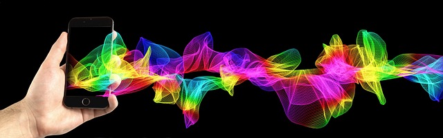
Gradients, a popular design trend from the 90s, have made a comeback in recent years and continue to be popular in 2023. They were initially used to add color and depth to designs but took a backseat to flat design in the late 2000s. However, they have recently been used to enhance flat designs, add color overlays to photos and add texture to backgrounds. Gradients show no sign of slowing down in popularity, and it will be interesting to see how they continue to evolve in design in the future.

Why are gradients so trendy right now?

Gradients have been trending in recent years due to the increased use of flat and minimalistic designs. Gradients add depth and dimension to a design and can be used to create a sense of movement and dynamism. They also help to add a sense of playfulness and fun to the design, which is highly desirable for the user. Additionally, the advancements in technology have made it easier to implement gradients in design, and the widespread use of mobile devices and high-resolution screens has made gradients look more visually appealing. Gradients are also being used as a way to stand out among the competition, as they offer an easy and effective way to make a design look unique and modern.

Advantages of gradients

  1. Gradients add visual interest and depth to a design. By blending two or more colors, gradients create a sense of movement and depth in a design. This can make a design more engaging and visually appealing.
  2. Gradients can be used to communicate hierarchy and emphasis. By using gradients with contrasting colors, designers can draw attention to important elements in a design. For example, a gradient can be used to highlight a call-to-action button or to make a title stand out.
  3. Gradients can be used to create a sense of branding and personality. By using a specific set of colors, a gradient can be used to create a visual identity for a brand. This can help to establish a consistent look and feel across a company’s various digital properties.
  4. Gradients can be used to add warmth and personality. Gradients can be used to create a sense of warmth and friendliness in a design. By using warm colors, such as oranges and yellows, designers can create a sense of warmth and friendliness in a design.
  5. Gradients can be used to create a sense of movement and dynamism. Gradients can be used to create a sense of movement and dynamism in a design. For example, a gradient can be used to create the illusion of movement in animation or to create the sense of a background that is in motion.

In conclusion, gradients are a powerful tool in UX design. They can be used to add visual interest and depth, communicate hierarchy and emphasis, establish branding, add warmth and personality, and create a sense of movement and dynamism. Gradients can be used to improve the overall user experience by making a design more engaging and visually appealing.

Business Card Mistakes To Avoid 

By giving out business cards, you’re opening the door to contact. You are introducing your company, providing your contact information, and arousing interest in your enterprise. All of this can only be realized with a strong design. All the time and money you spend making business cards would be wasted with just one little error. Because of this, we’ll discuss some frequent business card errors brands make and how to prevent them.

 There are a few errors that reduce the efficacy of business cards.

Excessive use of colors or typefaces

On a business card, as opposed to other marketing materials where you communicate to your consumers in whole phrases, you merely make a few key points. Therefore, you need to have a plan in order to discern between each type of information. Some people turn to utilize a distinct color, a different font style, or perhaps both for each detail. Some make it difficult to discern each detail by using bold fonts, italics, or excessive line width fluctuations.


Too many typefaces and colors can both detract from the visual appeal of your business card. They give the design a crowded, disorderly appearance. because they influence how a design feels. Additionally, typefaces have a part in it. You don’t want to mislead your clients. You just want to
present your brand to them smoothly.


Failure to use the secure printing area


Do not fill every available square inch of space just because you have a limited amount of room to deliver your content. This is what occurs when you don’t pay attention to the cutting lines and borders in
business card designs.


Poor pictures


Although they are not required, images do help your design appear more modern. Additionally, patterns that appeal to the eye are simpler to recall. Here are several errors to avoid when using graphics in your
business card designs, though.


Using stock photographs: Use actual photos, not stock photos, when displaying your products or services.

The credibility of your business card design is compromised by stock photos.


Using photographs of bad quality: Whether it’s a headshot or a snapshot of a product, choose a photo of high quality that will print well.


What Color Psychology Can Do for Your Conversion Rate

Most people underestimate the importance of color when it comes to influencing people on the Internet. Colors remain in the background, so we don’t notice them. Nevertheless, it’s the main color that conveys emotions and creates a certain ambiance for the site.

As part of this article, we will discuss the psychology of effective site design, focusing on colors in particular. Colors evoke beauty, but they also change perceptions, making them the second most significant factor in business efficiency. It can be used as both a motivator and a stimulant to motivate someone to act, such as buying a product, if you manipulate it correctly. Furthermore, you can create an atmosphere that is calm and peaceful.

The wheel of colors

The color wheel consists of seven basic colors: red, orange, yellow, green, blue, indigo, and purple. The other colors can be obtained by blending complementary colors. These are called secondary colors. Colors have opposite colors that create the strongest contrast. A website’s colors are more than just decoration. Nevertheless, they are an essential component of your business, which may determine its success.

Similar colors – these colors look good together; they complement and enhance one another, creating a peaceful and comfortable environment. You can easily find them by looking at the color next to the one we’ve selected on the color wheel. There will be no difference in appearance.

An example would be purple, blue, and pink. Colors according to mood and sensation – warm and cool colors.

Colors can inspire people to act or purchase (warm colors), or they can soothe and calm them down (cool colors). For example, red, yellow, and orange are warm colors. Blue, green, and violet are cool colors.

Combinations of colors

There is more to selecting colors than just picking one or two. They must harmonize with each other to create a unified image, with each color serving a specific purpose. Three colors are grouped in a triangle on a color wheel, making it a well-balanced and reliable color scheme.

The scheme is based on four complementary colors that cross over one another into a contrasting rectangle. By using a vibrant palette, the website can become a hit: it evokes a sense of joy and happiness. Sequential systems combine colors that we previously called analogous or similar. There are a few instances where this color combination is used, but it can create an interesting effect.

Color schemes can have a significant impact on your site’s success. Users should experience the top positive emotions at the end of the experience.

Emotional perception of color   

Color and user reaction play a significant role in influencing conversion in e-commerce. Consider the colors and what stands out to you. The color orange is associated with vigor and creativity. Dark yellow suggests wealth and comfort, while bright yellow implies energy. The most appropriate color to use for corporate websites is blue; dark tones are even slightly depressing. For things that are trendy and interesting, purple is a great color to use. The color black is highly attention-grabbing and should not be overdone.

Final thoughts

There is no doubt that color plays an influential role in web design, so you should consider it from the start. Green or blue websites do not affect the emotions and impressions users feel when they visit them. A subconscious part of us tells us to click on a button. We rarely pay enough attention to it because it is not visible.

Types of Icons and How to Use Them to Improve User Experience

Well-designed icons can improve device user-friendliness by saving screen space as they substitute text labels, they make it easy for users to identify apps, they can be easily understood and do not require translation for international users, and they are good targets for mouse or finger. A good icon design does all, so here is how to develop a good icon.

Icon Types

The first step is identifying the three types of icons.

Universal icons

First are universal icons, which are conveniently named as they are represented by universally understood pictograms. If there is a music app, it is represented by a musical note, making it a universal icon. It goes without saying that your icons need to be represented by something simple that can be universally understood.

Conflicting icons

The second type is a conflicting icon. These are icons represented by ambiguous pictograms. For example, a star or heart as the choice of your icon will be confusing as they both can be taken to represent liking a post, so if both are used, users might be tempted to confuse the two and dread the experience of having to learn the difference, therefore avoid this practice.

Unique icons

The third type is a unique icon. These are icons that represent products of unique functionality, out of the scope of universally understood pictograms. If you find yourself in this situation, avoid creating icons that will require the user to learn. Although a unique product, design a simple icon but provide a suitable label that can be easily understood; for example, Facebook’s icon is just an “f,” but the label is “Facebook.”

Using labels to enhance icon usability

This brings us to the next step, which is using labels to improve icon usability. It was found by a UserTesting study that icons with labels had an 88% predictability success rate by first-time users, compared to 60% for icons without labels. This data indicates that having a text label that supplements a well-designed icon makes it easier for users to identify icons, thus improving user experience. Take this into consideration when designing icons for your user interface. This is also powerful in avoiding the pitfalls of conflicting and unique icons.

These tips will aid you on your journey of developing a great user interface. Always remember to keep your icon design simple and focus on the functionality of the object. You do not want to keep users in suspense over the icon design but rather want it to be easily identifiable by any user, thus making a seamless user experience, and unless your product falls under the bracket of being represented by a universal icon, it is best to provide text labels. You also need to test your icons out on people to identify whether all objectives have been achieved. Can users identify the icon, and can they remember it?

It is important to take the user experience into account when developing any product and user interfaces are no different. Our devices are the most important things in our lives, and it is important that they are easy to use. Use these tips on how to improve user experience through icon design.

What You Need to Know about Graphic Design Types

The goal of graphic design is to solve problems and communicate ideas visually through typography, imagery, color, and form. Many designers specialize in one type, while others are more likely to concentrate on a set of related and similar types. Due to the constant changes in the industry, designers need to be flexible and lifelong learners to be able to add specializations to their resumes.

Graphic design can be divided into eight basic types:

  1. Graphic design for brand identity

Businesses and organizations establish relationships with their audiences through brands. Brand identities communicate the personality, essence, memories, emotions, and experiences of an organization. This is what graphic design for visual identity is about: developing the visual elements of brand identity that communicate the intangible qualities of a brand visually.

Creating elements suitable for all visual media requires an understanding of all forms of graphic design. A good communicator, creative and conceptual thinker, avid researcher, and interested in trends and industries is also a must for a designer.

  • Graphic design for marketing and advertising

Companies hire marketing designers to create assets for their marketing strategies. Designers can create collateral for print, digital, and other media types or specialize in a particular form of media (vehicle wraps, for example). Digital assets are increasingly used in content marketing and digital advertising in addition to print materials.

Examples of marketing graphic materials are flyers, posters, banners, brochures, website images and blogs, billboards, magazine and journal ads, etc.

Positions in this area at the entry-level are great for learning processes and gaining valuable skills and experiences. An understanding of print and online production is required, as well as proficiency with graphic design, layout, and presentation apps.

  • UI graphic design

Designing user interfaces for ease of use and user-friendliness is what UI design is all about. Screens, keyboards, and mice all form part of a UI. UI designers work on desktop apps, mobile apps, web apps, and games. UI developers write code to make the app work, while UX designers determine how it works.

  • Graphic design for publications

Book design, newspaper design, magazine design, and catalog design are all examples of publication design. Publication graphic designers create carefully selected typography and accompanying artwork in collaboration with editors and publishers. Publishers hire publication designers as freelancers, agency members, or in-house employees. An excellent ability to communicate, layout, and organizing is required.

  • Graphic design for packaging

Concepts are developed, mockups are created, and print-ready files are created by packaging designers. As well as strong print and industrial design skills, they require excellent conceptual and problem-solving skills. To meet the needs of clients, marketers, and manufacturers, they must be flexible.

  • Graphic designs in motion

Graphics in motion are called motion graphics. In online media, television, and film, these effects can include animation, audio, typography, imagery, video, and other methods. Technology and video content have made the medium more popular than ever. Storyboards provide designers with a starting point for their concepts, which then become a reality.

  • Graphic designs for the environment

By creating memorable, interesting, educational, and easier-to-navigate spaces, environmental graphic design connects people with places. A broad category of design is environmental design. Murals, signage, museum exhibitions, office branding, retail store interiors, and conference and event spaces are some examples.

Designing the environment involves graphic, architectural, interior, landscape, and industrial disciplines. There is a common tendency for designers to have both architectural and graphic design training and experience. As a way to create a more engaging experience, digital interactive displays continue to grow in popularity.

  • Graphic designs for art and illustrations

There is often a misconception that graphic design and graphic art are the same. But that is not true. The purpose of design is to communicate and solve problems, and the purpose of graphic arts and illustration is to create original art.  In creating their work, graphic artists use a wide variety of media and techniques. Many graphic designers also work as illustrators and graphic artists (and vice versa) thanks to overlapping skills and apps.

For the right type of graphic design, use the right tools

It is a rapidly growing field that requires skilled and specialized designers. Identifying the right graphic designer for your project will be easier if you know the types of graphic design.